Lane Plot
The Data by Lane pane displays plots that allow you to view quality metrics per lane. These plots have the following features:
|
•
|
You can select the displayed metric, surface, and read (when applicable) through the dropdown lists. |
|
•
|
The chevron in the top right hand corner toggles the plot between pane view and full screen view. |
|
•
|
You can zoom in/out and pan the plots. |
|
•
|
By right-clicking an image you can copy it to the clipboard. |
The plots share a number of characteristics.
|
•
|
The red line indicates the median tile value. |
|
•
|
The box outlines the interquartile range (the middle 50% of the data) for the tiles analyzed for the data point. |
|
•
|
The error bars delineate the minimum and maximum without outliers. |
|
•
|
The outliers are the values that are more than 1.5 times the interquartile range below the 25th percentile, or more than 1.5 times the interquartile range above the 75th percentile. Outliers are indicated as dots. |
|
•
|
The numbers above the X-axis indicate the number of analyzed tiles used for the data point. |
Figure 4 Data by Lane Plot
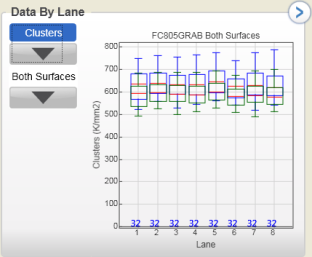
You can monitor the following quality metrics with this plot (blue boxes are for raw clusters, green boxes for clusters passing filter):
|
•
|
Density—The density of clusters for each tile (in thousands per mm2). |
|
•
|
Clusters—The number of clusters for each tile (in millions). |
|
•
|
% Phasing, % Prephasing—The percentage of molecules in a cluster for which sequencing falls behind (phasing) or jumps ahead (prephasing) the current cycle within a read. The graphs are split out by read. |
|
•
|
% Aligned—The percentage of the sample that aligned to the PhiX genome. The graphs are split out by read. |
|