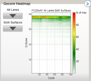
QScore Heatmap
The QScore Heatmap displays plots that allow you to view the QScore by cycle. These plots have the following features:
| • | You can select the displayed lane and surface through the dropdown lists. |
| • | The color bars to the right of each chart indicate the values that the colors represent. The charts are displayed with tailored scaling; the scale is always 0 to 100% of maximum value. Right-clicking allows you to change the color scheme. |
| • | The chevron in the top right hand corner toggles the plot between pane view and full screen view. |
| • | By right-clicking an image you can copy it to the clipboard. |
Figure 7 QScore Heatmap
