|
|
|
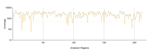
Coverage by Amplicon Region Plot
The Coverage by Amplicon Region plot shows the number of bases plotted against the amplicon region.
It has the following features:
| u | Amplicon regions with coverage values less than the low coverage threshold (0.2 × amplicon mean coverage) are highlighted in red. |
| u | The dotted, horizontal red line marks the low coverage threshold. |
| u | The orange line marks the moving average of all coverage values. |
| u | Only on-target amplicon regions are shown in the plot. |
Figure 2 Example Coverage by Amplicon Region Plot
Coverage values for each amplicon are detailed in the downloadable Export (CSV) file.
For Research Use Only. Not for use in diagnostic procedures.