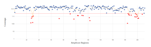
Coverage by Amplicon Region Plot
The Coverage by Amplicon Region plot shows the number of bases plotted against the amplicon region. It has the following features:
|
▶
|
Amplicon regions with coverage values less than the low coverage threshold (0.2 * amplicon mean coverage) are highlighted in red. |
|
▶
|
The horizontal red line marks the low coverage threshold. |
|
▶
|
The orange line marks the moving average of all coverage values. |
|
▶
|
Off-targets are excluded in the plot. |
Figure Example Coverage by Amplicon Region Plot
Coverage values for each amplicon are detailed in the downloadable Export (CSV) file.
TruSeq Amplicon v2.0 App Online Help