Flow Cell Chart
The Flow Cell Chart shows color-coded quality metrics per tile for the entire flow cell.
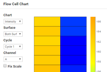
Use the Flow Cell Chart to judge local differences per cycle, per lane, or per read in sequencing metrics on a flow cell. It is also an easy way to see the %≥Q30 metric, which is an excellent single metric to evaluate a run. Do not use the Flow Cell Chart to look at downstream analysis metrics.
The Flow Cell chart has the following features:
|
•
|
You can select the displayed metric, surface (if your system scans multiple surfaces), cycle, and channel (base) using the drop-down lists. |
|
•
|
The color bar to the right of the chart indicates the values that the colors represent. |
|
•
|
The chart is displayed with tailored scaling by default, or you can fix the Y-axis scale by selecting the Fix Scale checkbox. |
|
•
|
Some metrics (% ≥Q20 and % ≥Q30) are monitored for a single cycle by default, or you can monitor the cumulative metrics (up to that cycle) by selecting the Accum checkbox. |
|
•
|
Tiles that have not been measured or are not monitored are gray. |
|
•
|
You can focus on an area of interest by dragging to pan the view or using the mouse wheel to zoom in. |
The following table details the possible metrics displayed in this chart. The available options vary by run.
Flow Cell Chart Options
|
Intensity
|
This chart shows the intensity by color and cycle of the 90% percentile of the data for each tile.
|
|
FWHM
|
The average full width of clusters at half maximum (in pixels). Used to display focus quality.
|
|
% Base
|
The percentage of clusters for which the selected base (A, C, T, or G) has been called.
|
|
% NoCall
|
The percentage of clusters that have no call.
|
|
% ≥Q20 and% ≥Q30
|
The percentage of bases with a quality score of > 20 or > 30, respectively. These charts are generated after the 25th cycle, and the values represent the current scored cycle.
|
|
Median Q-Score
|
The median Q-score for each tile over all bases for the current cycle. These charts are generated after cycle 25. Use this setting to examine the Q-scores of your run as it progresses. Because it relies on a single threshold, the %≥Q30 plot can be oversimplified.
|
|
Density
|
The density of clusters for each tile (in thousands per mm2).
|
|
Density PF
|
The density of clusters passing filter for each tile (in thousands per mm2).
|
|
Clusters
|
The number of clusters for each tile (in millions).
|
|
Clusters PF
|
The number of clusters passing filter for each tile (in millions).
|
|
Error Rate
|
The calculated error rate, as determined by a spiked in PhiX control sample. If no PhiX control sample is run in the lane, this chart is not available.
|
|
Phasing, Prephasing
|
The estimated percentage of molecules in a cluster for which sequencing falls behind (phasing) or jumps ahead (prephasing) the current cycle within a read.
|
|
Legacy Phasing Rate, Legacy Prephasing Rate
|
The estimated percentage of molecules in a cluster for which sequencing falls behind (phasing) or jumps ahead (prephasing) the current cycle within a read.
Legacy rates consider only the first 25 cycles.
|
|
% Aligned
|
The percentage of reads from clusters in each tile that aligned to the PhiX genome.
|
|
Occupied Count (K)
|
The total number of wells (in thousands) on the flow cell containing clusters with DNA usable for sequencing. Wells with at least nine G bases called in the first 10 cycles are considered empty. Low occupancy rate combined with low %PF may indicate the loading concentration is too low. High occupancy rate combined with suboptimal %PF may indicate the loading concentration is too high.
|
|
% Occupied
|
The percentage of wells (for patterned flow cells) or nonduplicated spots (for nonpatterned flow cells) on the flow cell containing clusters. Wells with at least nine G bases called in the first 10 cycles are considered empty.
|
|
Corrected Intensity
|
The intensity corrected for cross talk between the color channels by the matrix estimation and phasing and prephasing.
|
|
Called Intensity
|
The intensity for the called base.
|
|
Signal to Noise
|
The signal to noise ratio is calculated as mean called intensity divided by standard deviation of noncalled intensities.
|
Note the variable scales used on these different parameters.